As I was doing some updates on my new WordPress website, I decided to look back and revisit the older iterations and versions of my portfolio website. Before this website you see now, the layout of my portfolio came across several redesigns, both published and scrapped. Here’s a brief history and showcase of the evolution of my personal website and portfolio describing the different changes it went through over the years.
Just to give you a brief background, I’m a self taught designer and developer. Looking back at what I did over the years made me realize how much I have improved in terms of design and development.
Design #1: A very personal design layout

Design #1 was one of my personal favourites. It features a unique user interface in which the objects in the background serve as the buttons. Different objects link to different categories of art I produce. I made each background element from scratch and pieced them altogether in Adobe Dreamweaver. At that time, tables were used instead of divs, and the problem I had with it was that it was difficult to implement in varying screen sizes.
Design #2: Dark and Minimal

Design #2 never really made it to the world wide web. It was a more “professional” take on Design #1 (or so I thought). This design kind of takes away the creativity of Design #1, though I’m not entirely certain why I had to use a prehistoric selfie on my website. Seeing this now makes me cringe.
Design #3: A combination of Designs #1 and #2

Design #3 was a more user-friendly version of Design #1, while being a more creative version of Design #2. The idea I had for this layout was that each gallery item will have its own page and that all the pages would then seem to follow a certain template. I also wanted to be able to post updates or announcements through the website, but at this time, I had to publish updates manually by directly editing the HTML of the website.
Design #4: Minimal + Typographical

Another one of my favourites, Design #4 used a lighter theme as opposed to the previous themes. I wanted to keep this version minimal and typographical– two concepts I have come to love over the years. This version of my website was the first, full portfolio website that was published online. Luckily, you can still visit this version here.
Designs #5/6: A website inspired by Interactive Maps

Designs #5 and #6 were two concepts born out of the same idea. Design #5 was more descriptive of the featured artwork, while Design #6 heavily focused on the artwork as it covers the whole screen. In these two designs, I wanted to be dynamically populate the contents of my website using jQuery– one of my newfound skills from developing interactive maps– but I realized later on that it would be easier to populate the contents using a database instead.
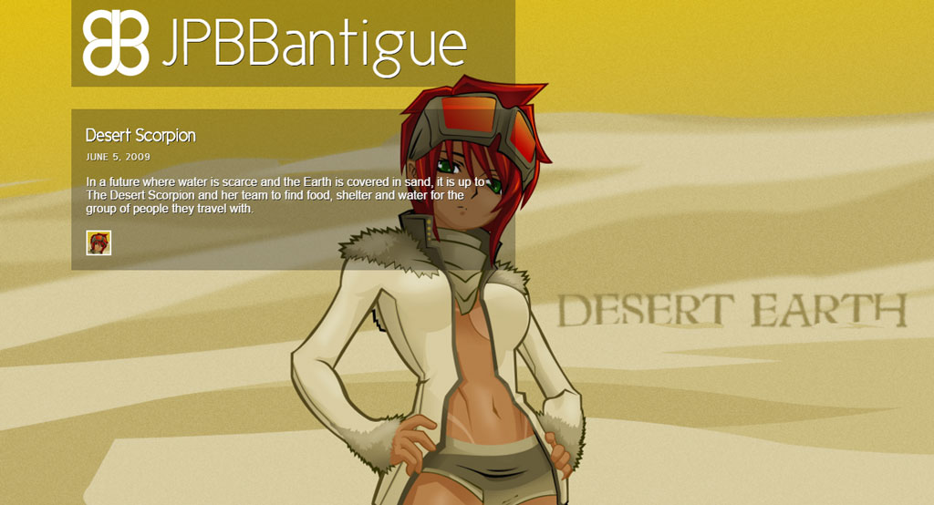
Design #7: Minimal and interactive

Design #7, the last of my personal favourites, is also minimal and a bit personalized in a way that for each category an artwork falls into, the thumbnail that represents it has a certain type of formatting– thumbnails that have thicker shadows symbolize different colour variations of the same artwork as compared to thumbnails that have thinner shadows.
This version of my website was also the most advanced so far, since this has its own custom Content Management System. I used to have a live version of this site, but since the connection to the database was lost, the data is not being populated properly.
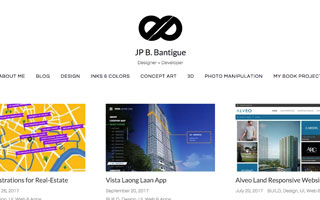
Design #∞: A combination of my favorite concepts
Finally, the latest and possibly last iteration of my website you’ll ever see, is customized from a WordPress base template: keratin. I decided to use WordPress for this final iteration so that I can easily update it without having to manually code the entire site.